


Using an “axis of importance” diagram to evaluate sources
By Daniel Hirschler
When I look at training journalists – or as is the case at the National University of Laos (NUOL) in Vientiane – training journalism teachers, I try to focus on the basics: What makes a journalist a journalist? And what is it that he or she has to contribute to creating “added value” in the information chain?
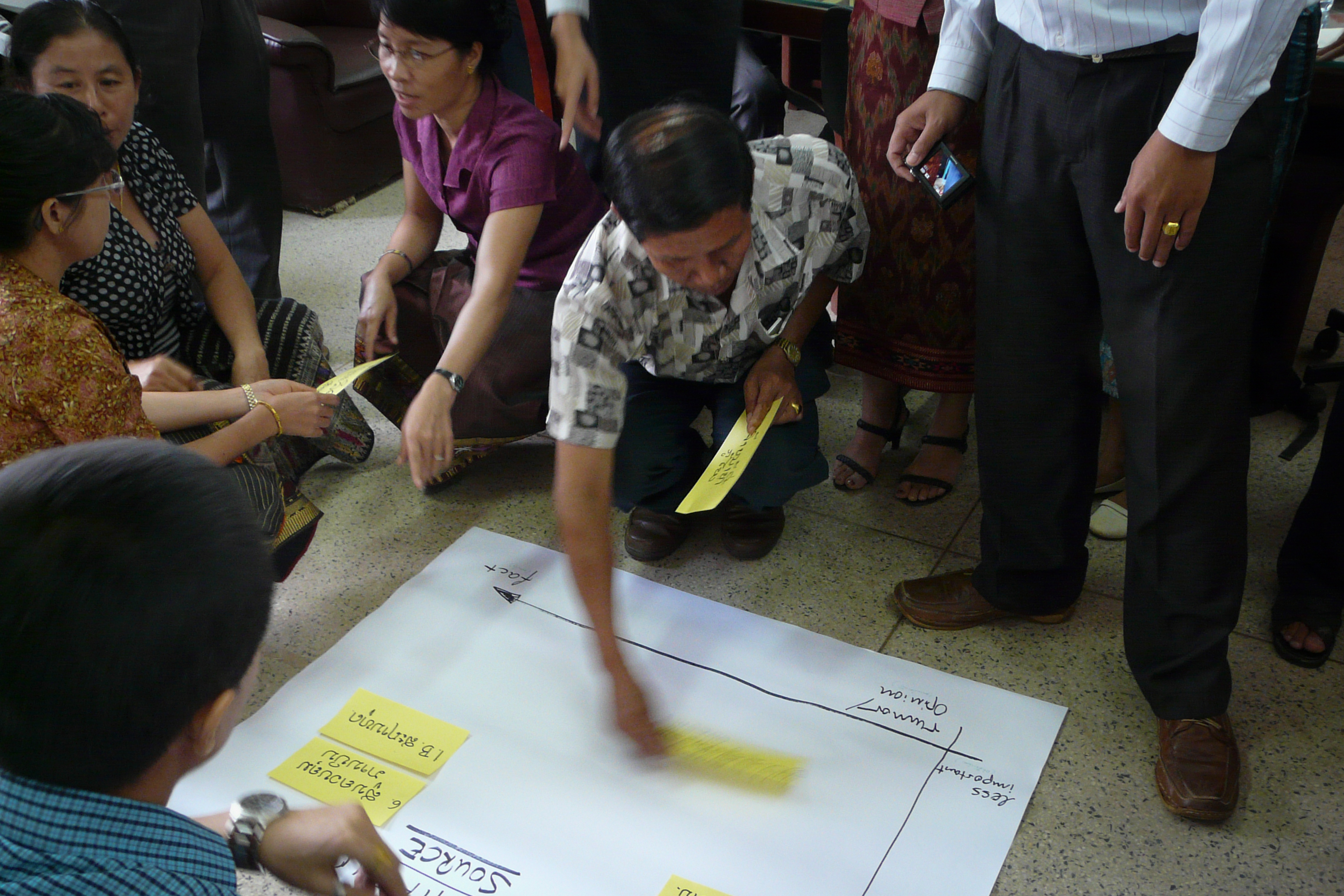
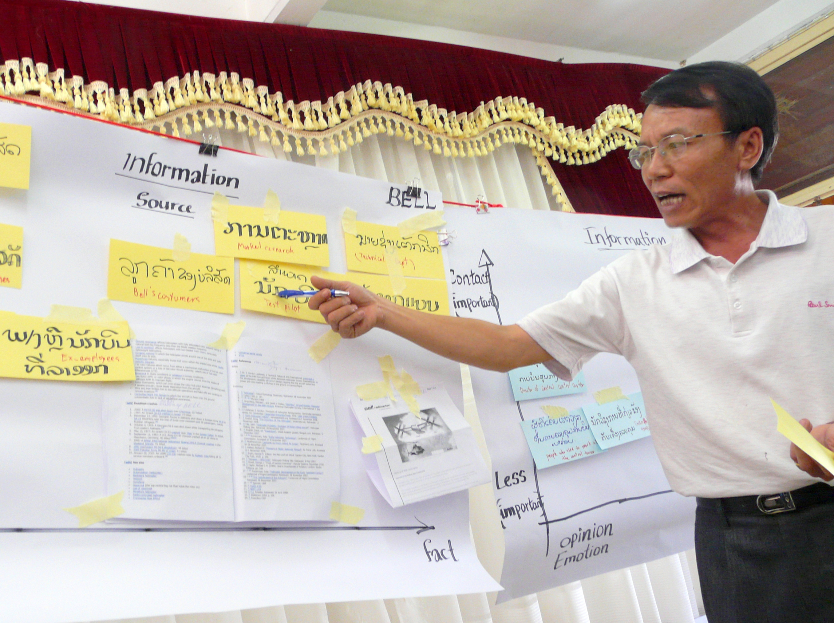
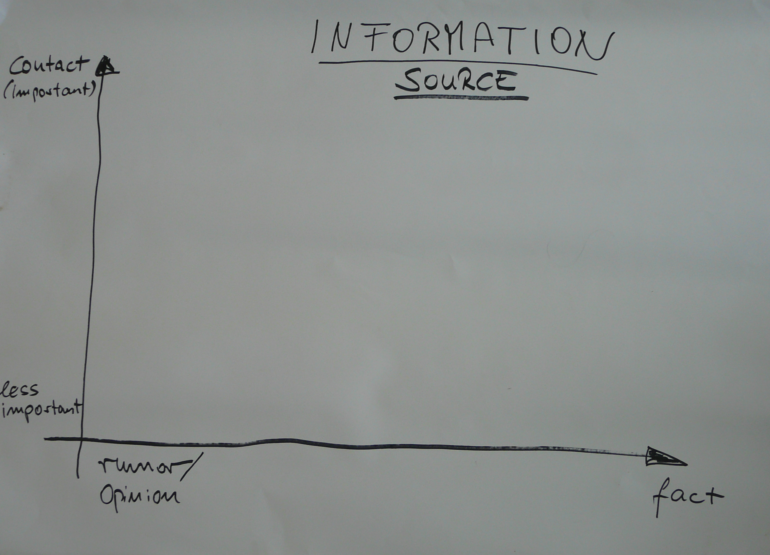 Out of one workshop at NUOL came a good tool that fits perfectly into that quest. It’s a diagram that helps journalists evaluate their sources (see photo at left, click to enlarge).
The process is as follows: If you have a source, first decide whether he or she is to be categorized as less or more important (more about this ranking later).
 Then take a look at what the person is saying: is it more of a rumor or opinion or is it instead a fact (or observation). Place the source accordingly along those two axes (see photo at right).
Using an “axis of importance” diagram led in this case to fruitful discussions about this crucial question. For me this is one of the main values of working with such “open” visual tools. They facilitate the structuring of the learning process and at the same time support rather than hinder the "flow" of a group.
 The group we were working with came up with the following “indicators” of importance (in orange at the bottom of photo at left).
The tool was developed jointly by my colleagues Michael Karhausen and Linda Rath-Wiggins. Michael is a journalist, Linda’s main job is developing new formats for Deutsche Welle’s multimedia content. Both work as consultants and trainers with DW-AKADEMIE and each brought different mindsets to the situation.
As a seasoned reporter and editor involved mainly in day-to-day newsgathering, Michael isn't likely to use such a diagram on paper in his daily routine. One could say he has it stored it in the back of his mind; it comprises gut feeling, instinct and experience. Linda is currently investigating data journalism where the main idea is to visualize complex data sets so that audiences can make sense of them.
 Out of this combination came a tool that is very helpful for training and teaching. It serves as a focal point for discussions, facilitates communication and makes it easy for learners to gain entry into the somewhat complex field of evaluating sources for stories.
Do you have suggestions regarding this tool? Or want to share one of yours with us? Leave a comment below.
Daniel Hirschler is a DW-AKADEMIE trainer and project manager who worked extensively in Laos.
Photo credits: Daniel Hirschler and Michael Karhausen
2011-04-12


![]()